AI-powered unified social inbox
Duration
~ 6 months
Company
Nectar
Team
Emma (Sole UX Designer),
Jennifer (PM),
Mike (Developer)
My role
User research /
UI UX design /
User testing
Background
Customer support staff at small e-commerce companies often manage over ten social media accounts. Nectar is a social media management tool designed to help them manage multiple accounts in one place. The platform initially focused on content scheduling, but recently launched an MVP of a new feature that allows users to manage messages from different platforms—such as TikTok and Instagram—in a unified inbox for greater convenience.
However, after launch, despite many users granting message access, overall user activation and user retention rate remained low. The company then brought me on board to redesign this feature and integrate AI to enhance workflow efficiency and user activation.
Result
Improved user activation rate to
44.7%
Resolved more inquiries per day, increasing productivity
x 3
Time to complete common inquires reduced by
58%
0.1 Problem
First, I wanted to understand what problems user are facing.
1.Lack of conversation context
Since this was a newly launched feature, there was no existing message history, so users had to start from scratch and didn’t know how to continue the conversation.
2.Unclear message types
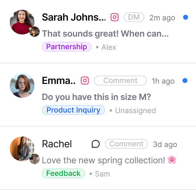
Users couldn’t easily tell whether a message was a private DM or a public comment
3.Unclear message ownership
It was difficult to tell who was responsible for each conversation, which created even more confusion in team collaboration scenarios.
4.Repetitive responses
Users often had to reply to the same types of questions repeatedly, which was extremely time-consuming.
Their Old Design
02. Wireframe & Prototype
There were many iterations for each feature. I’m not showing all of them here in detail, but I’d be happy to discuss them further. Feel free to contact me at xtang000@gmail.com to learn more.
❓1.Lack of conversation context
In the beginning, the platform didn’t import previous chat histories, so all conversations were disconnected. We added an import feature to make everything more seamless and easier to follow.
❓ 2. Unclear message types
We redesigned the layout to separate direct messages (DMs) from comments.
❓3. Unclear ownership
We designed a clearer task distribution system that allows users to assign messages to specific team members. Administrators can also customize how messages are automatically distributed in the settings.
❓4.Repetitive responses
The AI reply feature allows users to customize their brand tone and automatically generate responses, helping reduce repetitive replies and improve efficiency.
Layout & AI bot exploration
Version 1
A three-column layout made it easier to view customer information.
AI Auto reply
Version 2
Switched to a two-column layout, Simplified info, highlighting only the most important details.
AI copliot
Message card exploration
03. User Testing
Testing the prototype with 5 existing users and 5 potential customers
Avg. satisfaction rate
7.5
" The conversation import takes quite a lot of time, and I don’t think I’ll actually need to refer back to that many old messages."
Users can finish all tasks by themselves
10/10
"The AI feature is great, but the setup is tricky. I’m unlikely to organize all the information beforehand—it would take too much time."
04.Iteration
Chat import process optimization
We redesigned the import process, instead of the default 30-day import that took around 12 minutes to set up, users can now customize the time range and see an estimated import duration to better manage their expectations.
Old
New
AI Setup Optimization
In the new version, we optimized the AI feature setup process. We now provide common setup tips such as adding shipping or return policy information, where users can simply paste a website link. For product details, we encourage users to upload an Excel file and offer export tips to guide them through the process.
Old
New
Further Optimization in AI Workflow
We also introduced a feature that allows users to save chat conversations as training materials, adding them directly to the AI copilot’s knowledge base to continuously improve its responses.


